Developing a product analytics dashboard for a mobile app
How we moved mobile app analytics from spreadsheets to automated dashboards. Visualization of marketing metrics and cohort analysis.
About the Client and the Problem
A product company is developing its own mobile app. The product generates a large volume of data, which was reliably stored on the backend in a PostgreSQL database. The main problem was the lack of a convenient analytics system. The product manager had to compile tables manually, and the company founders did not have access to transparent statistics in real time.
Task and Technology Stack
The task was to visualize key product and marketing metrics: user acquisition, advertising costs, retention, and the audience’s payment behavior. To implement the project, we chose a reliable and efficient stack: a PostgreSQL database and the DataLens BI system for building dashboards. The DataLens toolset fully covers the product’s needs in data visualization and processing.
Workflow and Solutions
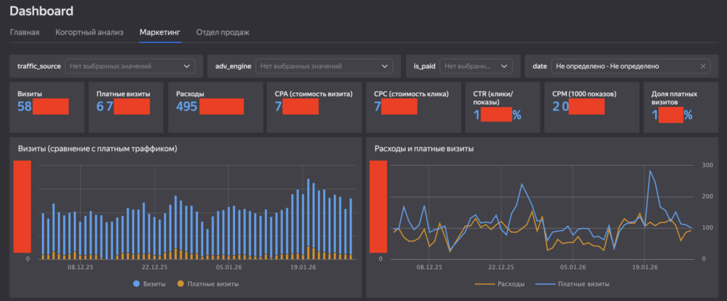
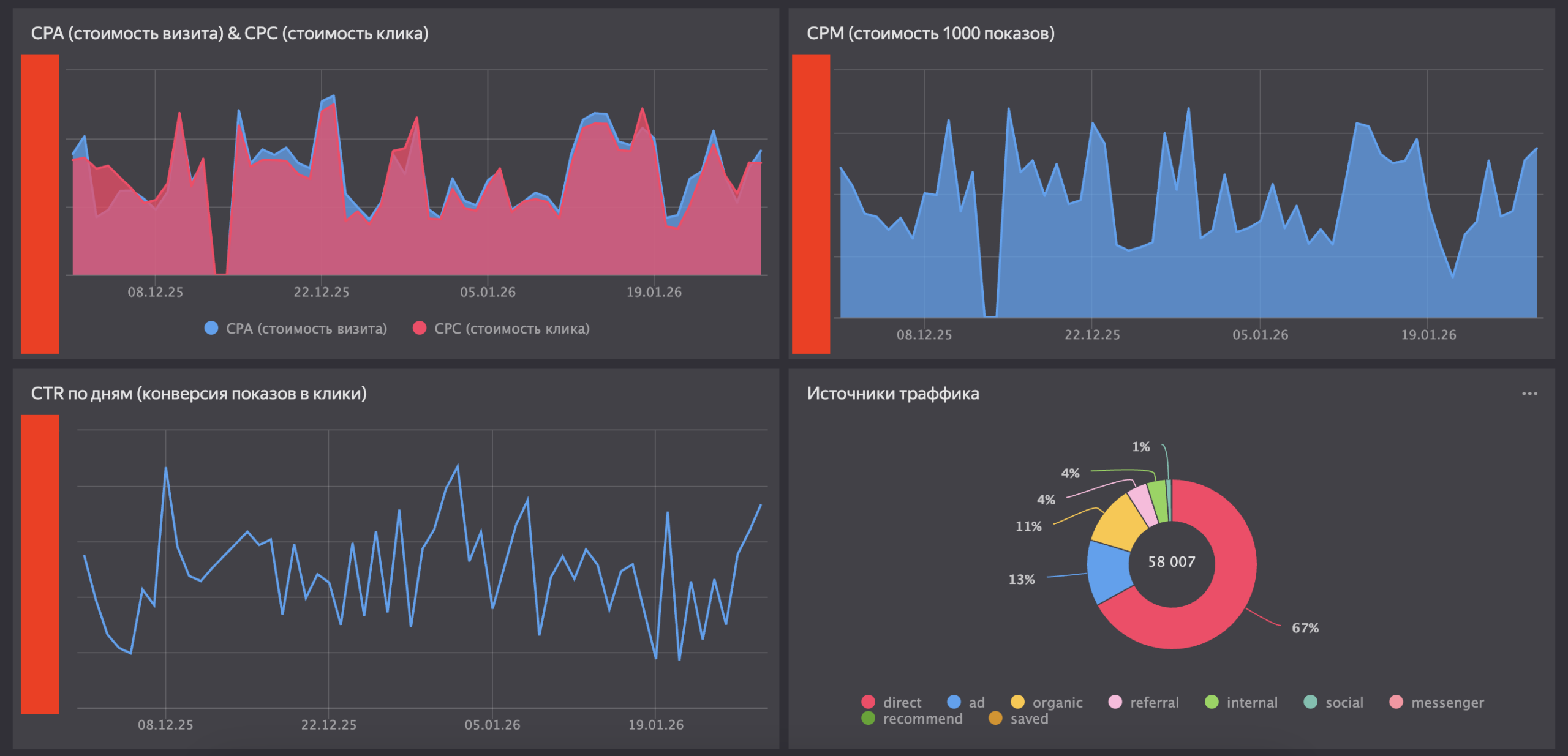
1. Marketing and Traffic Source Analytics
As a first step, we developed a summary dashboard with key marketing metrics. At the top level, we placed cards with the most important metrics: visits, paid visits, expenses, CPA, CPC, CTR, and the share of paid traffic. The interface was equipped with convenient filters by sources and time periods. The charts reflected the dynamics of changes. Comparing expenses with the number of paid visits allowed the team to control the efficiency of budget spending during CPC fluctuations. Revealed Insight: When building the traffic sources chart, an anomaly was discovered (67% of the traffic was defined as direct). This signaled problems with UTM tagging, which caused some paid traffic to be classified incorrectly. The tagging bug was promptly fixed.
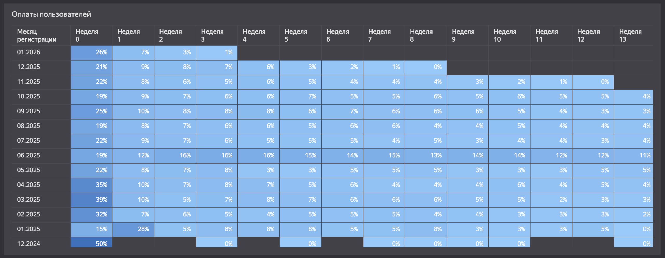
2. Cohort Analysis of Payments
For a mobile app with in-app purchases, it is critical to track the customer lifecycle. We built a payment heatmap by weeks of the user’s life. The rows display the registration month (covering data from the end of 2024 to the beginning of 2026), and the columns show the weeks. The visualization clearly demonstrated user behavior:
-
In week zero (right after registration), the conversion to payment reached 35-39% (during the peak spring months of 2025).
-
After the expected drop, a stable long tail is observed: users continue to make transactions in weeks 5 and 12.
This tool has become indispensable for the business, as it allows for accurately calculating the payback period for the acquisition costs of each cohort.
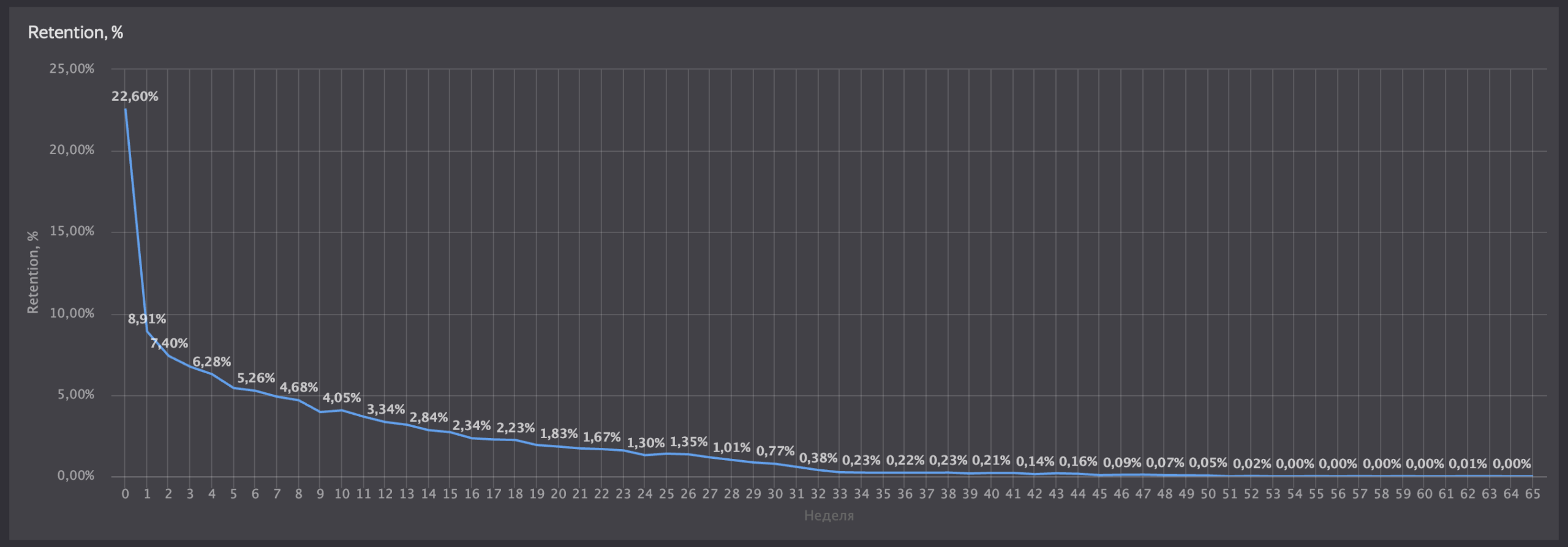
3. User Retention (Retention Rate)
To assess audience return rates, we visualized a classic retention curve. The chart reflects the real dynamics of the product:
-
In week zero, 22.6% of users return to the app.
-
By the first week, the rate drops to 8.9%.
-
Then, the curve turns into a long plateau, approaching zero around week 30.
The plotted curve helps the product team find the main points of audience churn and plan changes in the app.
Project Results
-
Full automation of reporting. The team completely abandoned resource-intensive manual data exports from the database.
-
A unified information field. The marketer, product manager, and CEO now get up-to-date figures via a link in DataLens in real time.
-
Business transparency. Data visualization not only simplified monitoring but also helped identify technical errors in analytics and find bottlenecks in the user funnel.